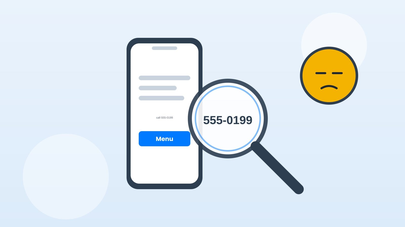
If customers need two fingers, a magnifying glass and divine intervention to read your phone number, your mobile website needs help.
Meet Priya. She runs a bakery, and most of her orders start on a phone — usually someone standing in a parking lot. Here's how she made her site a genuinely mobile-friendly website, in five steps.
1. Open every important page on your phone
Do not judge your site only from a giant desktop monitor. Check the homepage, services, contact page and forms on an actual phone.
Priya found her order form was cut off on the right side. Nobody had told her — they just left.
2. Make text easy to read
Use readable font sizes and good contrast. People should not need to pinch and zoom to understand what you sell.
Light grey text on a white background looks elegant on a monitor and invisible in sunlight.
3. Give buttons some elbow room
Make call, quote and booking buttons easy to tap. Tiny links jammed together are a recipe for accidental clicks.
A good rule: if a thumb can't hit it on the first try, it's too small.
4. Keep navigation simple
Use a short menu and clear labels. Customers should find your hours, services and contact details without a scavenger hunt.
Five menu items is plenty. Fifteen is a filing cabinet.
5. Test speed and forms
Submit your own contact form and tap your phone number. Check load times on mobile data, not just office Wi-Fi.
If the form thanks you but no email arrives, you've found the leak.
A mobile-friendly website makes it easier for customers to contact you when they are ready. And they're usually ready while holding a phone.
Simply500 builds every site mobile-first, because that's where your customers actually are.